A week ago we released a major update to powerOne that brought the look of the application in line with iOS 7. It was a major overhaul. Every aspect of the application was touched and, in the process, plenty of bugs were found and squashed.
The release created a minor uproar among some of our customers though. While some people absolutely loved the re-design, others hated it. From most of those customers we received very constructive feedback, including many things we didn’t, and in some cases couldn’t, have foreseen before releasing.
We learned things like the new look was hard to see in sunlight (we live in Oregon so don’t see sun this time of year :-), it was particularly hard on color blind people (should have thought about that one especially since my wife’s brother is color blind), the contrast wasn’t strong enough for poorer eyesight, and the buttons felt smaller (only because there were no borders as in reality all buttons are larger).
We are human over here, folks, and we work very hard to make the best choices we can. We do what we think is right then we get feedback and make adjustments, which is what we are doing now.
Here is what we are going to do: instead of one calculator design option, we are going to give you three. The themes will be available in the calculator settings. Since we made the mistake last time of not soliciting feedback, I thought this time we would. I’ve added the three screens here. Please leave a comment to this post or email help@infinitysw.com to tell us what you think.
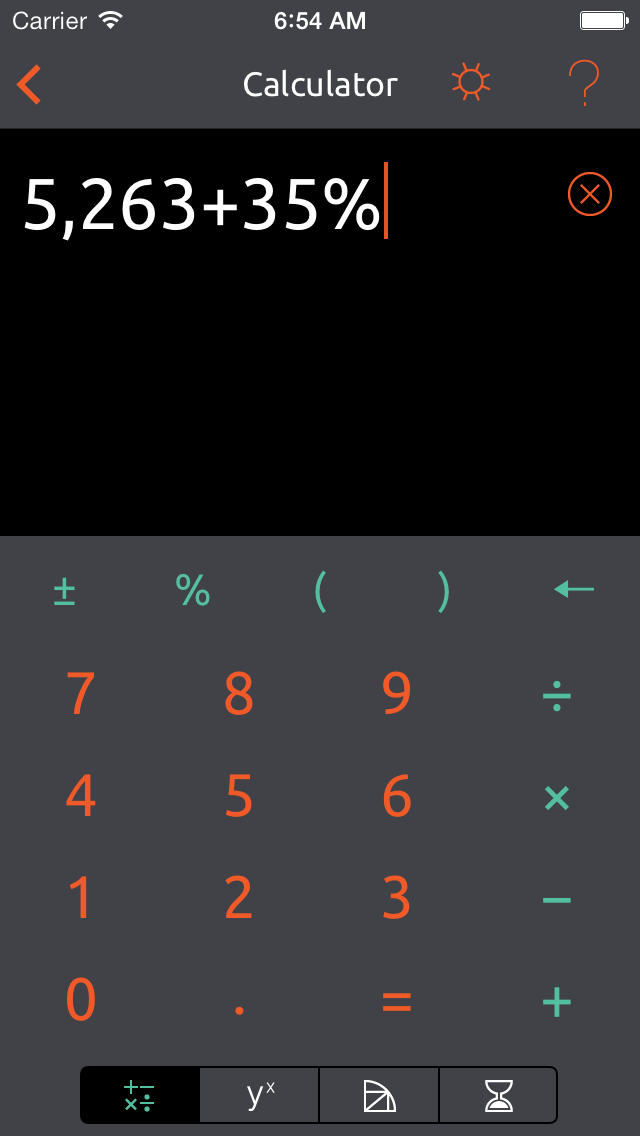
Theme 1: This is the original v4.0 theme. We still really like this and think it is the closest we can get to the iOS 7 design aesthetic. While it will be available, however, it will no longer be the default. It might just be a little too radical for some.
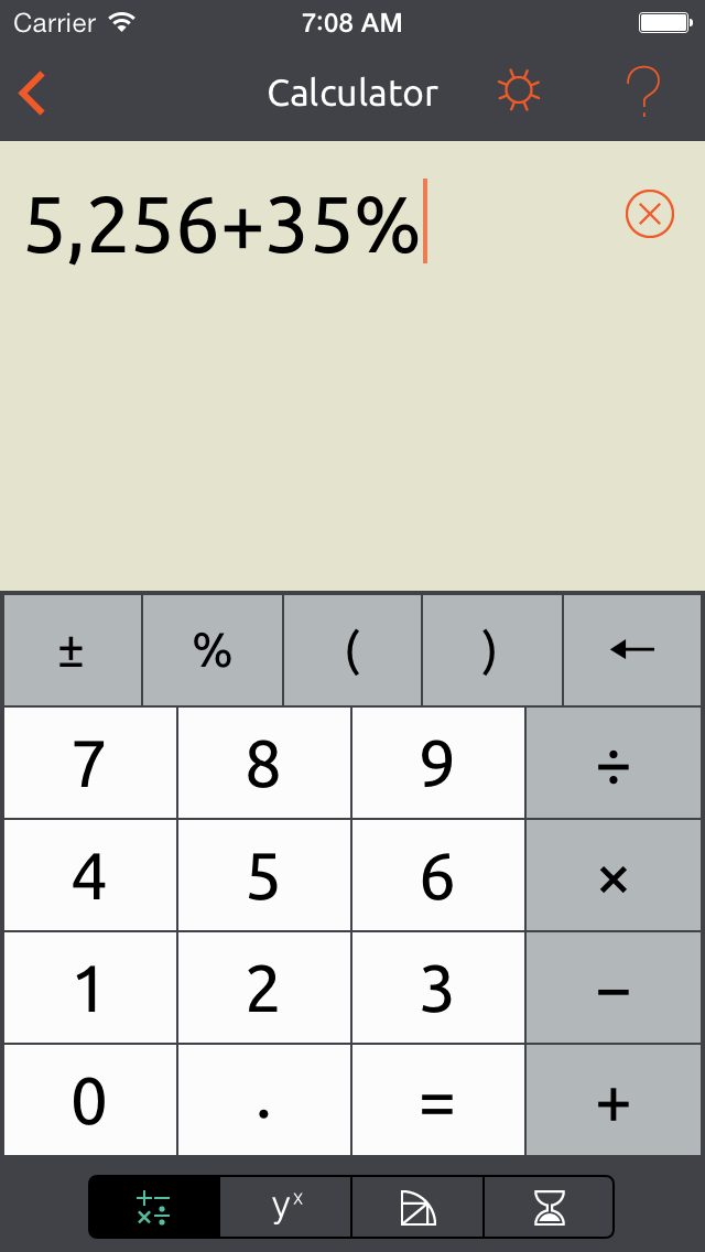
Theme 2: This theme is designed to be as close as we can get to the version 3 design but remain true to iOS 7. This theme should be good for those that need high contrast or just prefer the old look.

Theme 3: Personally, I’m tired of all the white and black in iOS 7 and wish people knew how to use another color. This theme still provides those striking colors prevalent in v4.0 but also provides more contrast a la v3. This will be the new default.
Again, I’m looking for your input, especially from those of you who don’t like the version 4.0 re-design. Please leave a comment here or email help@infinitysw.com.

I like the combination option.
I am impressed and appreciate your speed of response, very good business practice.
Rick
Thanks, Rick!
On Tue, Jan 14, 2014 at 9:03 AM, Elia Insider
I definitely prefer Theme 2. Maybe it’s because I’m getting older, but the colors are easier on my eyes. Thank you for addressing our concerns.
Thanks, Brent!
On Tue, Jan 14, 2014 at 9:13 AM, Elia Insider
Options are always good! Black on White works better for me. Ever try to read a book or news paper with white on black? Thanks for the options!
Vic
Thanks, Vic. Glad one of them works for you!
On Tue, Jan 14, 2014 at 9:52 AM, Elia Insider
The theme I like most is definitely “Theme 2”
But this is not ideal for me.
A lightly blue (or another similar color) background in my opinion is preferable to the white & more comfortable to the eye.
I ignore how much leeway the IOS gives you, so please take what follows with a grain of salt:
Why not give the user a certain liberty for configuring background & Characters colors?
Thanks for consulting your users
Thanks, Sam. At some point we may offer even more customization and themes. First thing first, though, I want to get something back out that solves the existing problems. Glad 2 works for you!
Thanks for listening and adding other screens, #2 works for me.
Thanks, Rich!
Thnx Jomothan.
To have the choice of 3 colour templates is an awesome idea. Colours are much easier to see and having the original colour template also very smart.
Thanks
Greg
Thanks, Greg. I assume one if these three will work for you?
Thanks for providing the options and acting so fast to accommodate your users. Theme two is closest to the original and I could live with it, but I like theme three best. It has a more modern design. It is not that different from your original, Theme one, but the greater contrast and addition of the boundaries of the keys makes all the difference.
Thanks, Harold. All three will be available and the third one will be the default. There will be a setting available to choose the theme. Glad you found at least one you like.
I also like the third version better. Your right to much white is what’s wrong with OS7, I have to turn my screen way down so I can see the text on the calendar app. I liked the dark calculator of 4.0 better than the previous version, but I still like the templates of the classic version better. Maybe it’s because I am color blind as well, but I have a hard time reading the separator lines of the new templates. I like the white on green, but I think all the white from the template bleeds out the white text on the line.
Thanks for the feedback, Gary. That’s interesting regarding the templates. Apple completely changed the style of tables so we had to do something different, but I didn’t think about the green and white of the separators, and the “bleaching out” from the fields.
My heads spinning from the calculator feedback. I’ll have to consider the template separators later!
Thanks for responding quickly to user feedback.
I prefer textured backgrounds, but would be happy with either of options 2 or 3.
The lack of button borders in option 1 just felt odd: on reflection I noticed this lack of borders was making me attempt to press right in the centre of each button – the perception being that they were tiny and awkward to use. Probably why I don’t like ios7 aesthetic actually.
Will be grateful to have the new options when released.
Thanks, Ted. Believe me, we would have preferred to have made no changes but the old, textured buttons don’t fit well with iOS 7.
When I started getting reports that the buttons were smaller I suspected it was the lack of a border.
Glad you like a couple of these.
On Wed, Jan 15, 2014 at 4:26 AM, Elia Insider
Thanks, Phil. The best we can do is put something out, see how people react, and then try to make fixes that work for both them and us. When we were working on version 4 we realized that themes were possible for the first time but we ran out of time to work on it. Hopefully in the future we can expand the possibilities.
I have to say that I am very impressed with how responsive you have been with regard to the change in the calculator. Being sort of old-school, I prefer version 2, but, as others have noted, version 3 does address the perception of tiny buttons. I’m glad that the update will have the option to select a look; actually the dark background would be an excellent choice if you are using the calculator in a nighttime environment and the flexibility to select a look in this case will be a big plus.