PowerOne 7 is here, and it’s the biggest visual change to the app in eight years.
I’ll admit I resisted. I’ve had a complicated relationship with Apple’s design changes since they unveiled iOS 26 and Liquid Glass in June 2025. But Apple’s platforms never stand still, and any app that doesn’t keep up eventually looks — and becomes — obsolete.
PowerOne 6 launched in 2018, and I haven’t been idle since. I’ve kept fixing issues in the mobile app, the web app and the server. But the UI itself hadn’t changed. PowerOne 6 didn’t look out of place on the new OS, but there was a catch. Apple only accepts apps built with its latest tools, and building with those tools pulls in Liquid Glass whether you want it or not. Some of PowerOne’s screens would have looked horrible. It was all or nothing. So I knew the redesign had to happen before PowerOne needed another fix of any kind. Otherwise, even a small bug fix would have turned into a rushed redesign.
I started by sitting down with the iOS and macOS apps that have embraced Liquid Glass. What did I like? What didn’t I like? Then I asked the same questions about PowerOne.
One thing jumped out: color.
Liquid Glass is meant to put the content first, not the chrome. Where the content isn’t naturally colorful, Apple’s own apps fill in with muted pastels and gradients. A calculator isn’t naturally colorful. And PowerOne 6, which looked right at home when it launched, now looked drab next to everything else.
I wanted PowerOne 7 to be bolder, and I love how it turned out.
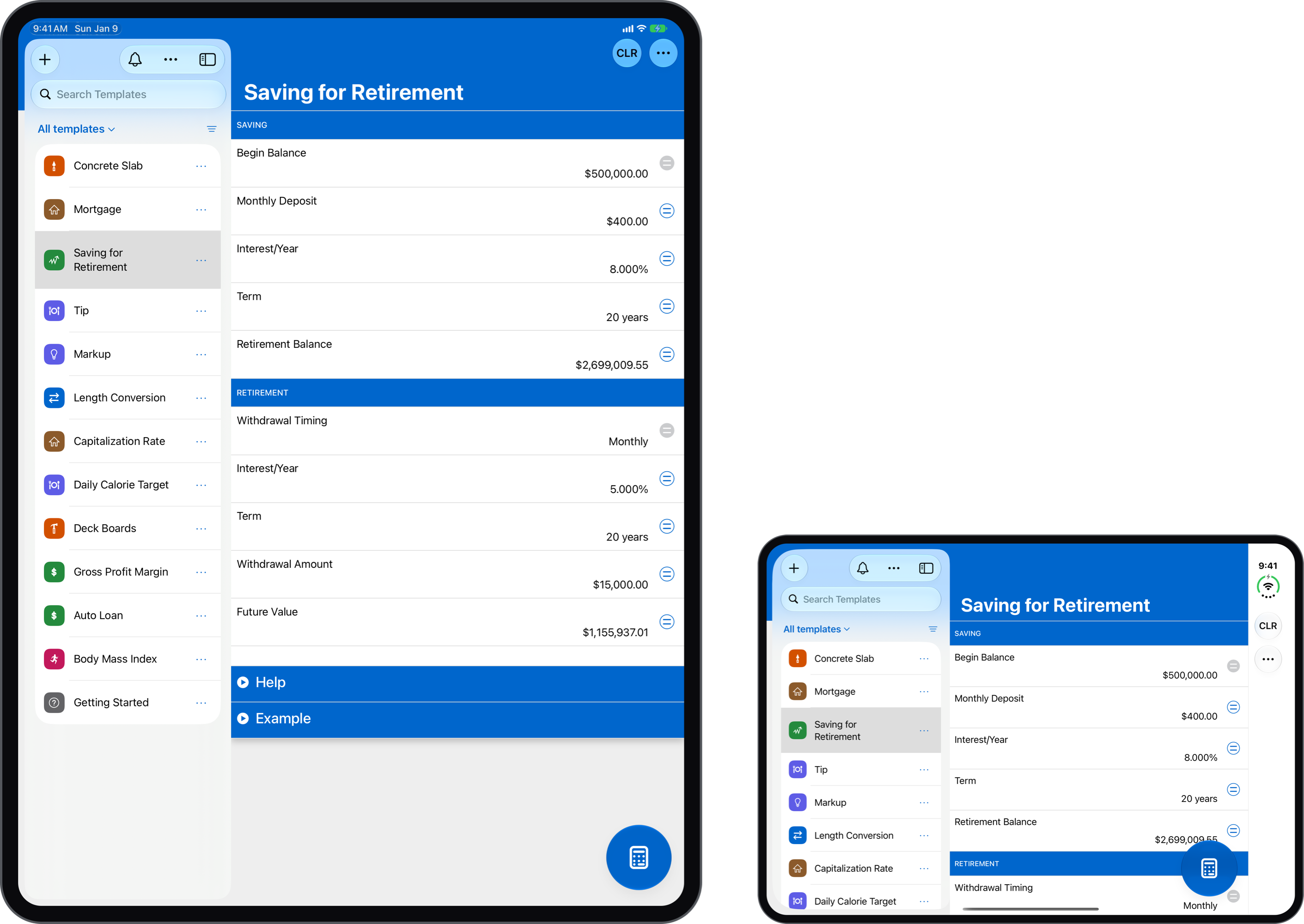
What I didn’t want was to move everything around. Templates, filters, sorting, the calculator, menus — they’re all where you left them. There are a few changes, but nothing major. My hope is that the Liquid Glass touches feel natural, the app feels as responsive as ever, and nothing gets between you and the answer you need.
Color
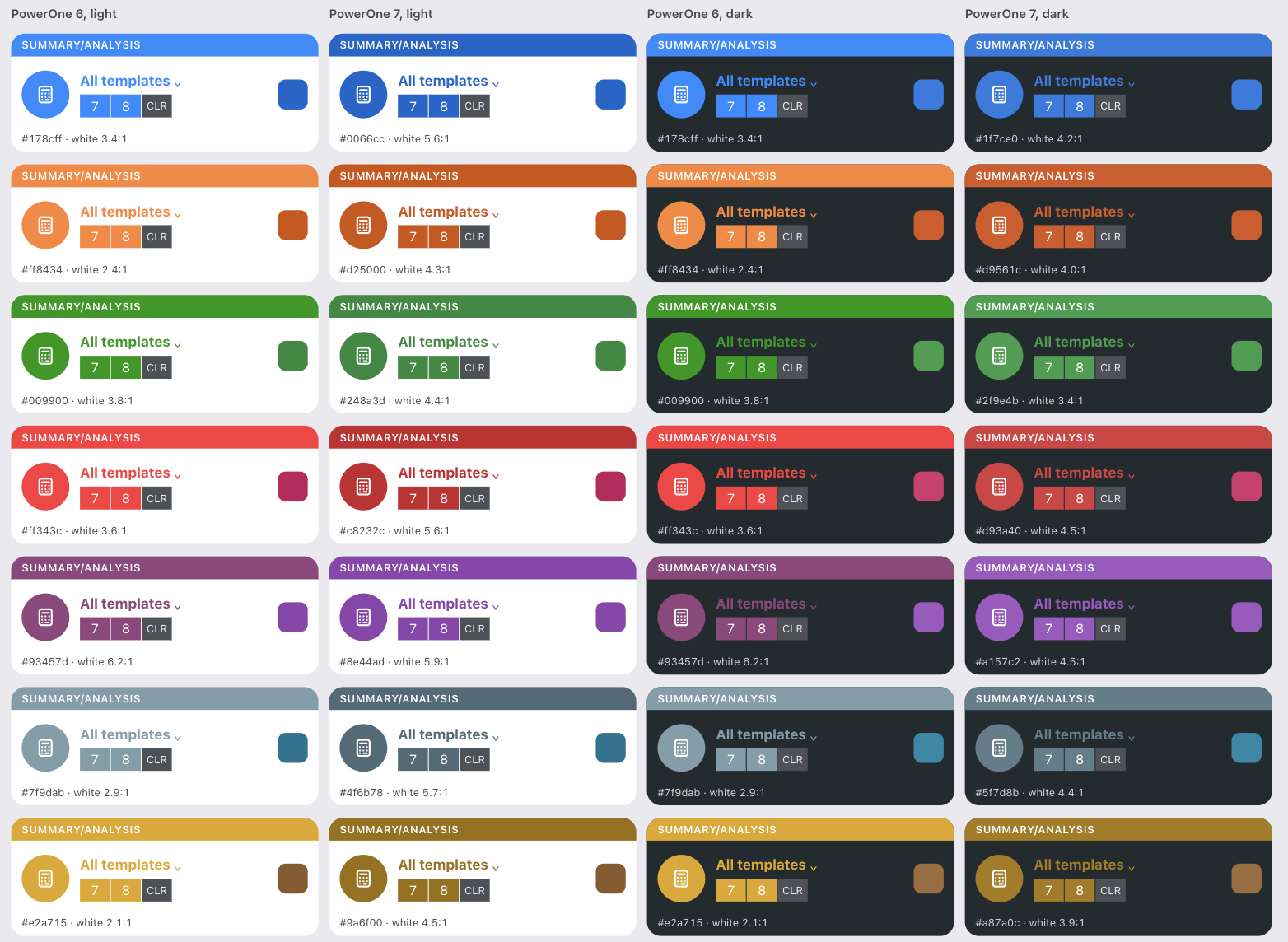
Every template now has its own colorful icon. The template view gets a colorful navigation bar, which extends behind the list view on the Mac, the iPad and the iPhone Duo’s inner screen. The calculator and keypads keep their color.
The theme colors are richer and deeper, too. I kept the old palette but deepened each color, and swapped yellow for gold.
You can now set the theme to light, dark or automatic. Automatic follows your device, switching between light and dark when it does.
Premium customers can also pick a matching app icon. Miss the orange icon from PowerOne Financial Calculator or the green from PowerOne Scientific Calculator? Their back, along with seven others.
Navigation
I didn’t want to make you relearn the app. PowerOne 6 completely redesigned the navigation, and frankly, it upset a lot of people. At that time I rearranged the app the way I felt it should have worked all along: the template list leads into the templates, and the calculator isn’t a template at all. It’s a special button you can reach from anywhere.
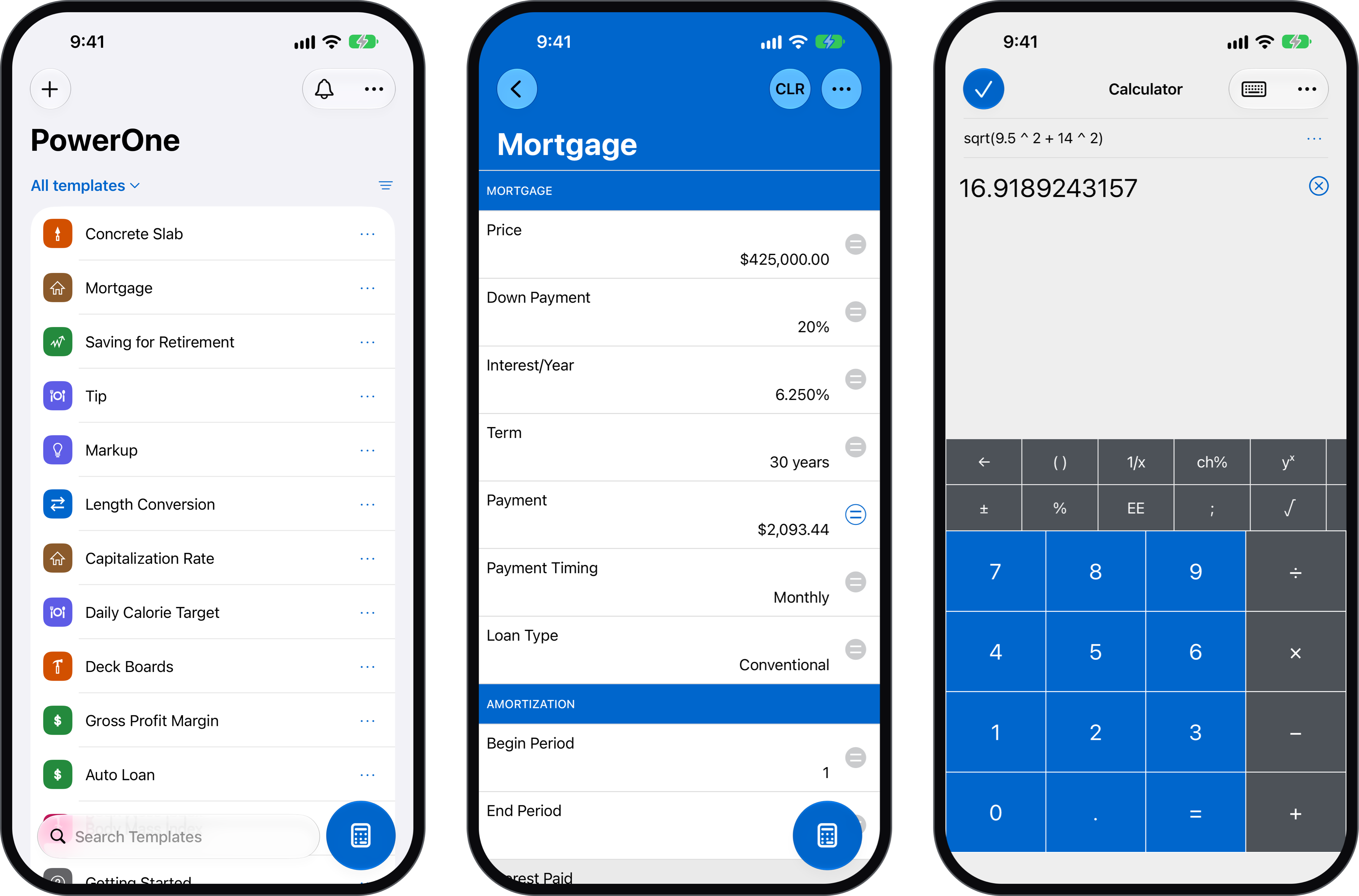
That model still works well. You can open the calculator from the template list, from inside a template, or right from a number row. The template’s values come along, available from the Template menu or directly on screen.
A few subtler changes were still warranted. In the calculator, for instance, the keypad options are now separate from everything else, so you can switch to the right keypad for the math you’re doing faster. Search also moved, to the bottom of the template list on iPhone and top for iPad and macOS. This change is inline with Liquid Glass norms.
A lot of work also went into reaching PowerOne from outside the app. Beyond long-pressing the app icon, you can now get to PowerOne through Siri, the Shortcuts app, Spotlight and the Action button. And the website now links straight to the app.
Staying in Touch
I also wanted a better way to talk with you. PowerOne 6 used a full-screen view to tell you what was new, but it was disruptive and you could only see it once. PowerOne 7 has a new notice system instead. Sometimes a notice appears at the top of the list view, but more often you’ll see a colored badge on the bell icon when there’s something new.
PowerOne turns 30 in 2028 (!), and I’d love to use this to share more about the product, post tutorials, and hear what you think.
Fixes
Oh my, the fixes. Every new OS retires something old. I had to completely overhaul the subscription system behind the scenes, for instance.
Among the rest:
- Syncing is more reliable, especially when you switch to a new device.
- The app now reopens the last template you used, not just the calculator.
- Placeholder text no longer appears in an editor row while you drag it to a new position.
- Dropbox images display correctly again.
- Dates are now correct in Thai and other regions that don’t use the Gregorian calendar.
And those are just the big ones. There are many, many smaller fixes too.
Crafty Weasel
One more thing I haven’t talked about before: a couple of years ago, I closed Infinity Softworks and started a new company called Crafty Weasel. (That name’s a story for another day. I promise to share it soon.)
The name changed, but I’m still the one building PowerOne, all these years later. I use it all the time and can’t imagine a world without it. I know many of you have relied on it for decades, too. I take that responsibility seriously.
Update to PowerOne 7 for iOS, iPadOS, and macOS today.
I hope you enjoy PowerOne 7.
Elia

