6 Lessons From A Contract Development Job

Last week was insane. I don’t think I’ve worked so many hours in a long time. My conservative estimate is 85 hours alone with my business partner in for another 70 or more. We are working on a contract job — got to pay the bills some how as powerOne has become a labor of love — and it all came to a head last week with a deadline for today. We made our deadline. Why so many hours at the end? Because there were too few hours at the beginning.

We have never done much contract work before this past year, at least not stuff that isn’t calculator related or where I am closely guiding the development requirements. This year we have done two such projects. The one early in the year was extremely well specified. We knew exactly what we were responsible for, how they wanted it done, and had header files of everything we needed to interface with. While the coding was different in some ways from anything we had done before, the project was well defined and very straight-forward.

This project, though, was open-ended. We had a basic requirements list but not much was well defined. Even the requirements list was fluid. So here are a few things I learned from this project:

1. Force a refined requirements list. I shouldn’t have bid on a project that was quite so fluid but I did. It’s a start-up, they are moving fast, and the project was right up our alley. Plus, they had a two month window so I wanted to get started. So we did.

Honestly this wouldn’t have been such an issue if we would have had more domain knowledge. But this is one of the few times in my career I developed a product where I didn’t have a sense for the customer.

2. Mobile is not the web. This is one I knew but reinforced once again here. In essence the partner company said here’s the website; go play with it. I did a little but given that it wasn’t my domain expertise and the site was complicated, I didn’t play enough. When developing, every layer we peeled off the site showed even more complexity. I didn’t understand the full extent of code required and not sure I could have from “playing with the site.”

3. Specify, specify, specify. Which leads me to #3: I should have focused everyone on creating a specification right up front. What did we need? How many layers were there to the site? How would we simplify the entire site to fit the mobile paradigm? We thought we could do this as we went but that was a problem. We spent too many hours re-writing code and their designer spent way too many hours writing APIs for features we didn’t use.

I had a professor who once said that writing an app is 70% planning and 30% coding. What he didn’t say is that most of that 70% needs to happen up front. As I mentioned, normally not a problem as usually I write apps I understand inside and out. But when writing for someone else, especially in a domain I don’t know? More planning up front.

4. Someone must be in charge. There really wasn’t any one in charge of decision making and planning on a day-to-day basis, or more accurately it was shared. The CEO of the company we were developing for is really a sales guy, so feedback came late in the process or not at all. Mostly we were left to make our own decisions and sell them to the company, but it took us a while to get the hang of that. Luckily, the company CEO is a very reasonable person.

5. UI first or data first. Every app I have ever written started with the UI. We designed what we wanted it to look like, the features we wanted, and then built the models to match. I spent the first few weeks of this project completely frustrated because this project was the exact opposite and I didn’t realize that. In this case the data (because of the web app) was well-defined and we should have started with the models and then built the UI from that. We started moving forward once we figured this out.

6. Simplify. I preach this over and over again for our own consumption. The same is true for contract jobs. There is never a UI or data model that can’t be simplified further. Again, so thankful the company’s CEO was so reasonable. I do hope they take these lessons and bring them back to the web.

Outside of the intense process at the end, it turned out to be a decent development project. I hope we can get back to working on powerOne and Equals, though, and that we can figure out how to turn those into sustaining businesses. I really don’t like writing code for other people’s ideas.

How Do We Know When We Have a Minimum Viable Product?

I was at a breakfast meeting yesterday and we got to talking about minimum viable product (MVP). I’ve written about this before, basically saying how speed of development and MVP are not synonymous. But the question arose: how do we know when we have a minimum viable product?

Before I answer that question, though, I want to make sure we all understand this incredibly important concept. A minimum viable product is the least development you can do to give your potential customers the idea of what you are trying to accomplish, what benefits this service/product might bring to them, and give you a feel for the revenues and costs associated with delivering the service/product. The point of MVP is to get those of us who are inclined to sit around the office and develop apps out of the office talking to customers.

Dropbox famously built their MVP as a video. I’ve seen paper reproductions and I’ve seen code. Sometimes wireframes work or a nicely mocked up PowerPoint presentation. Every one of these can get the idea across and get a conversation started. In fact I could easily argue that the less code you write the better off you are. [1]

It’s important to understand that most people can’t imagine what you are imagining. They need to see it or touch it to truly get it. And that’s why words on a page or a concept in speech is simply not enough. Physical is better. The decision about how to get that across to a customer, though, is up to you.

When we started working on an MVP for Equals we decided we needed to write code. The concept — writing a note that can tell the difference between text and numbers, performing any mathematics automatically — was hard to imagine. We felt it was important to show that ability so we started with an MVP that did just that and over the course of months refined its capabilities.

We also realized that there were a number of other things we wanted to test as well with customers. Would sharing be of interest? Would being able to send things to third-parties like Evernote, Twitter and Facebook be important? What about collaboration? History? Integrated data?

Some of these things were natural offshoots so we didn’t need to develop them. Once people understood sharing the idea of collaboration was a natural extension, very easy to discuss. Some we could put screenshots in place that simulated the look-and-feel but didn’t actually function. I didn’t have to build Evernote, Twitter and Facebook integration. Showing a table with those options was enough. When we developed the first Equals MVP we included no text formatting. We talked to potential customers about the idea but found that it didn’t stimulate a conversation. So we added functioning code. [2]

Once again, back to the original question: how do we know when we have a minimum viable product? We know when we have a hint of all the features we want to get a reaction to from the customer. Those features need not be complete and in many cases they don’t even need to be functioning. But they do need to spark a conversation.

After all, the whole point of the MVP is to get a sense from customers as to whether we are on the right track or not.

[1] This goes especially for non-developers. Stop asking people if they’ll write an app for you based on an idea. Mock the thing up in PowerPoint or Keynote using a tool like Keynotopia and go get customer feedback. That’s a heck of a lot cheaper than writing code.

[2] We also needed to prove we could do it in a cross-platform way.

Slugball

I was at a conference in Bend, Oregon, and met this guy Matt who was working on a sports email newsletter. I have followed sports since I was a kid. At one point I knew just about everything one could know about every player on every team.

But now I don’t have that kind of time. I get Cleveland Indians, Browns and Cavs news during the day and keep up with that. In the evenings I usually glance through the headlines at espn.com. But that’s it.

So when I met Matt and he told me he was working on a daily sports email newsletter I was intrigued. We talked about the idea for a bit: highlighting the non-obvious stories, the human interest ones, the ones ESPN just doesn’t report. I mentioned the story last year about the NFL player who blasted the Maryland lawmaker for being critical of another pro football player’s pro-gay stance, which never was mentioned on espn.com. He agreed that this is the kind of story he is interested in.

A couple of weeks ago he released his first issue. I thought I’d try it for a while and if it wasn’t to my liking, I’d unsubscribe.

I’m happy to say that the stories he reports have been incredible. Each issue includes about six articles and I’m happy to say that sometimes every one of them is too interesting to pass up. Monday’s issue had a story on a double murder in Brazil over a soccer game, how The Ohio State marching band is putting the screws to the competition, why kids still love baseball, and a story about a Japanese pitcher who had won 30 straight ball games. The best in that issue, though, was a story about a Nigerian basketball player who was fascinated by snow. And this was only Monday!

Enough of me going on about it. Check out Slugball. It’s an incredible dose of daily sports human interest stories right in your email box.

The End Of Blockbuster, The Foreshadowing Of Something More Ominous

I’m surprised it took this long, but DISH Networks is closing down the rest of the Blockbuster stores.

Apparently the average store was 5000 square feet, which means at its peak Blockbuster accounted for 45 million square feet of retail space! According to this article there is 14.2 billion square feet of retail space or 46.6 square feet per capita. According to the same article there were 1.1 million retail establishments in the US, or 1 establishment per every 313 people. Walmart generated revenues of $444 billion in 2012, $310 billion of that in the US. In fact the top 10 retail establishments alone generated $2.2 trillion of revenue in the US alone!

According to this article, we spent $200 billion online in 2011 and that is expected to rise to $327 billion in the next couple of years, although my guess is that is low. In 2012, Amazon alone generated $61 billion in revenue, all online of course.

I have shopping down the street. In fact if you live in the US almost everyone has shopping down the street. The former Borders store is still completely empty and across the street the remnants of the Blockbuster sign are still visible even though it closed years ago. Across town the Party Warehouse store sits empty and over by the mall the former Circuit City store has never really found a permanent new resident.

Meanwhile many more are on the brink. Can Best Buy survive and its 56 million square feet of retail space? How about Sears and J.C. Penney?

Why do I bring all this up?

Think of all the retail space Blockbuster controlled at its peak. 9000 stores. 45 million square feet. Think of all the employees that worked there. All those stores, all those employees without jobs, gone. Done in by Netflix, primarily, who employs next to no one.

If Walmart gets destroyed by Amazon then where do people work? Does Amazon hire them all as local delivery people?

So here’s the theme running through my head: as more businesses go online, as Amazon does to Walmart and Best Buy what Walmart and Best Buy did to mom and pop shops everywhere, what moves into these retail outlets? And where does everyone work? And if people aren’t being paid, then how do they buy goods and services, which keep other retail stores alive? And if people aren’t making money then who pays taxes that pays for the military, social security, Medicare, schools and all the other things a lot of people have come to expect from our society?

I’m not saying it’s going to play out this way. Something has always come along and smart people have shifted, from farms to factories to retailers.

But it doesn’t mean we can keep assuming the same rules apply, either.

Proper Badge Etiquette

I’ve spent a lot of time traveling the past month and was at a great number of events. At every event I went to they have some personal identification to  attach to the body, whether that is a badge with a clip, a badge on a lanyard to hang around one’s neck or a sticker.

The badge is important. These events are often quite loud and it is hard to hear a name. Plus I found I met so many people that names ran together, so having a badge to refer back to is important. The badge itself really only needs to say one thing — the person’s name. And the first name in particular needs to be very large. Bonus information is a company name, which can act as a conversation starter. (“So, what do you do at XYZ Corporation?”) It amazes me how few conferences get this right.

Since I have been at so many of these in the last month and I repeatedly see the badge screwed up, I thought I would provide a primer on proper badge etiquette.

Hang it high as close to the face as possible without being weird.

namebadge-correct

This is the best place. By hanging it as close to the face as possible — and assuming the name is big enough — it allows me to quickly glance down to see your name without truly diverting my entire head. By being able to glance down quickly, this keeps me from admitting visually that I forgot your name already. When hung lower I end up spending the entire conversation trying to figure out how to look at your name without looking like I forgot your name, which in essence causes me to miss the entire conversation.

The name needs to be as big as possible.

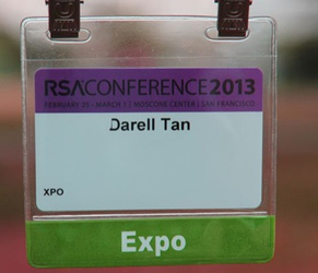
namebadge- small

Come on! You’ve got a whole card to work with. Write it big so I can see it. There’s no reason to save the rest of the card for anything. In this case the conference name is bigger than the person’s name. Do they really think I don’t know what conference I’m at?

Don’t play hide the name badge.

This one drives me nuts. The conference goes through all this trouble to provide name badges and then you stick it on a shirt and put on a jacket. The badge is behind the jacket. What’s the point of that?

Lanyards work but it isn’t the best option.

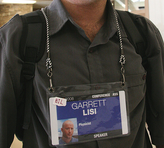
namebadge-secondbest

Lanyards — the piece of rope they use to put the badge around your neck — works, too, but they are usually too long. When talking to someone the badge usually ends up around the sternum, which when talking to someone is too far down to glance at and easily see what it says. Remember, at conferences we don’t talk at a normal distance. At conferences, just to hear the person you are talking to, we tend to stand at an inside-my-aura distance. This makes a low-hanging badge extra hard to see since the angle is all wrong.

Backwards name badges suck, too.

The lanyard badge above is a great design. It is very hard for it to flip backwards. But most lanyards have one tie in the middle and thus flips around backward. If you are organizing a conference, don’t be cheap. Buy the better lanyards. If you are at a conference with these flippable badges then it takes constant vigilance to keep it facing name-out.

If you are female don’t hang it on your breast.

namebadge-breast

For goodness sakes, I feel like a total creep the entire conversation if I need to look at that badge. Really. Even if you like it, I don’t.

I really don’t want to be glancing at your chest. Because of the placement I tend to glance fast — I don’t want to stare at some woman’s chest — which means if I miss the name I have to glance again! Oh, how humiliating.

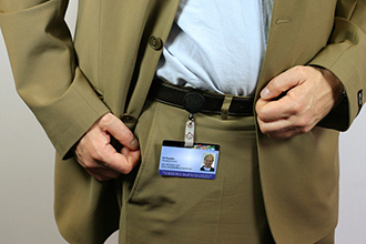
And finally, never, ever hang it on your belt.

namebadge-crotch

Seriously, folks, no one in their right mind wants to stare at your crotch.